Muirneag Print Media
Muirneag works regularly with other third sector organisations, often receiving funding and delivering projects on their behalf.
It's important to reflect the collaborative nature of these projects in the design language of each piece of media. Some projects require more thought around colour choice, others focus on form (blocky or sharp shapes vs more natural curves)
Simple circular shapes overlapping to visually convey the two organisations working on the project. The funder (PST) represented in a rich red, and the delivery agent (Muirneag) with their signature Muirneag orange.
A clear improvement on the previous flyer that lacked visual pull while both poorly conveying the benefits of the project and failing to present a clear and accessible call to action.
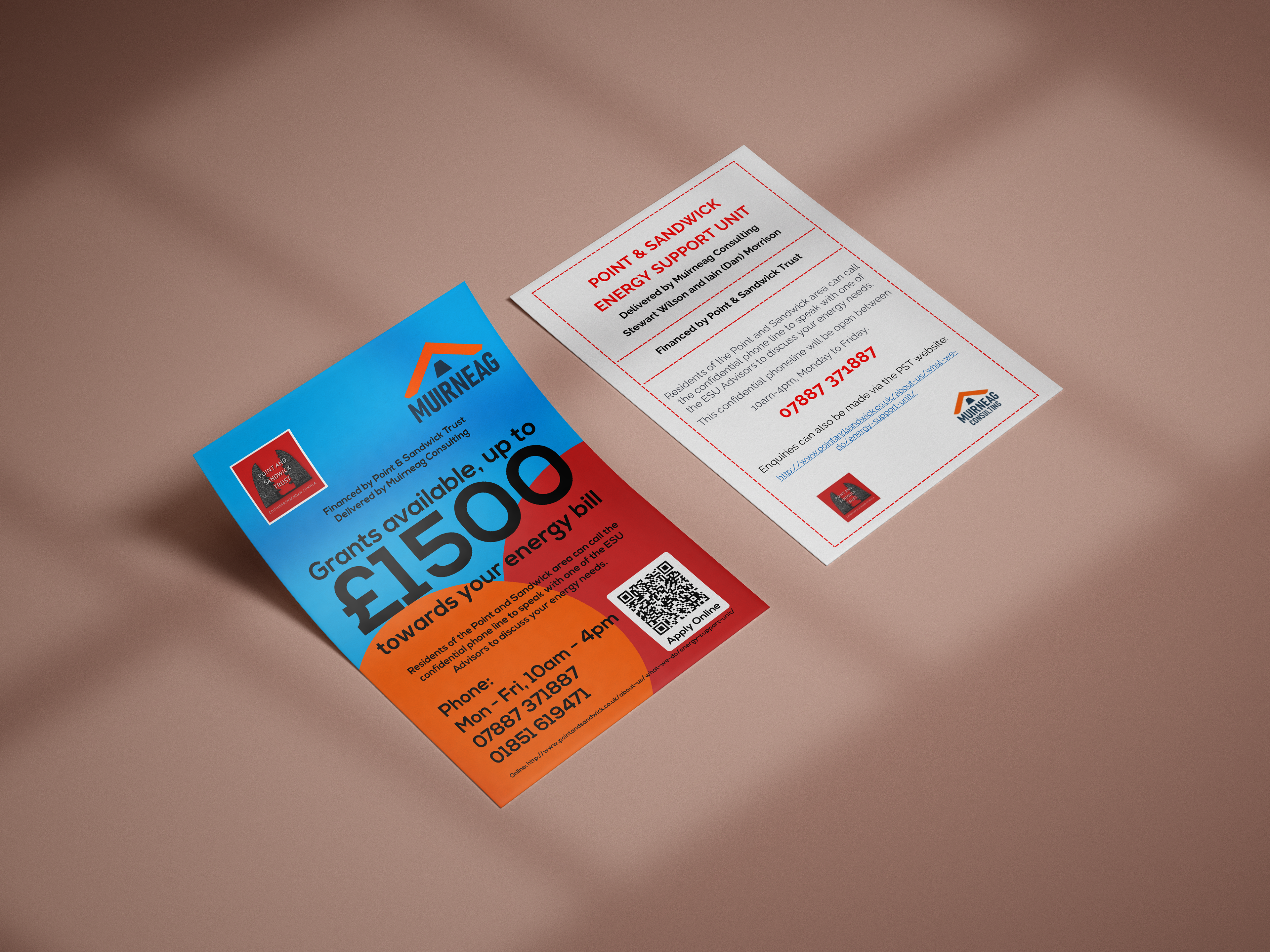
Before and after.
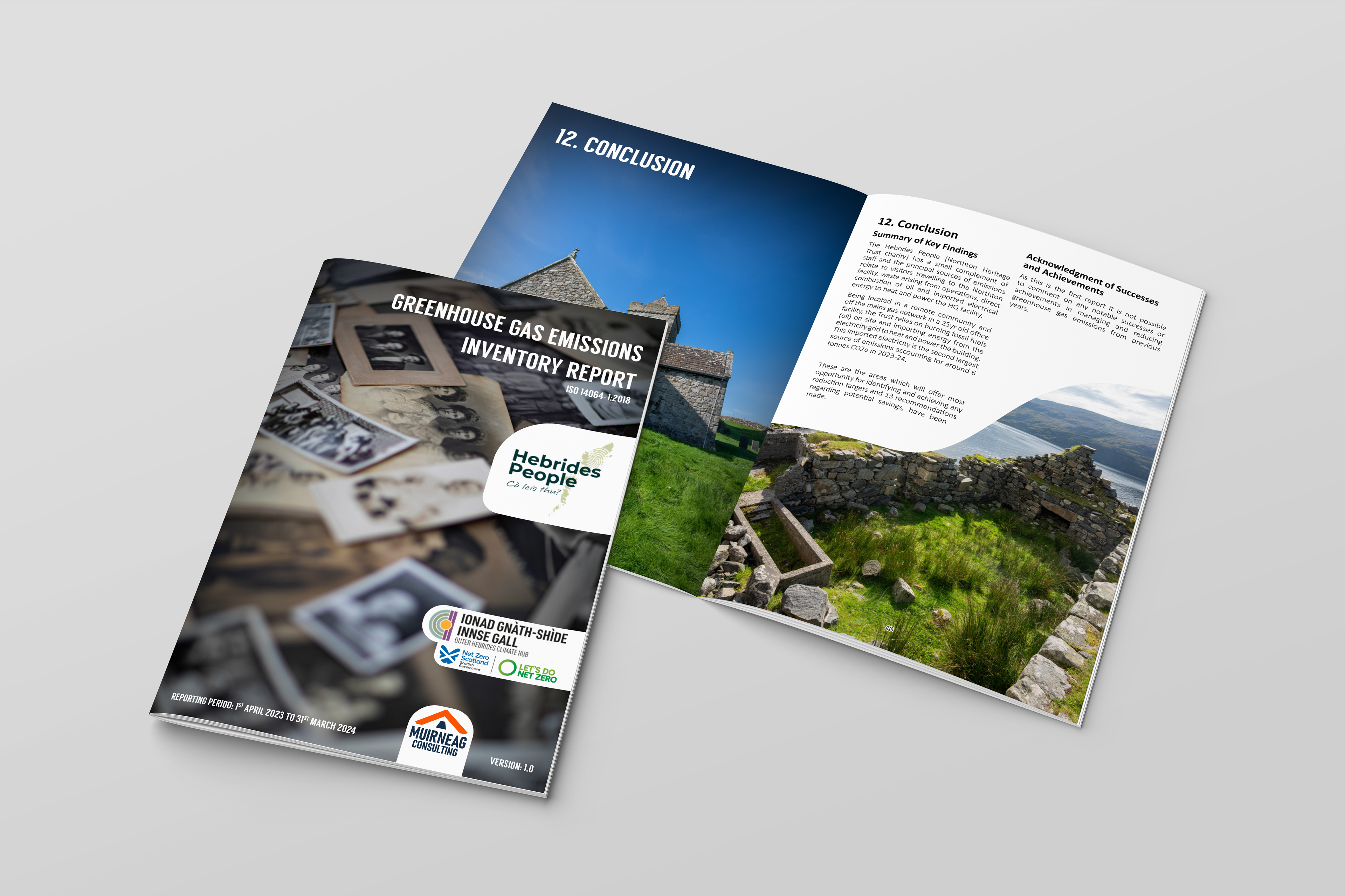
Full-page images lend themselves to covers and chapter headings.
Drama is eye-catching and can be used as visual punctuation.
Where flyers need to hold a lot of key information, it can often help to break up the information into visually separate areas (right) or to use clear visual hierarchy (left) complete with headings and low opacity background graphics.
When there's no room for eye-catching images, loud colours can often have the same effect.
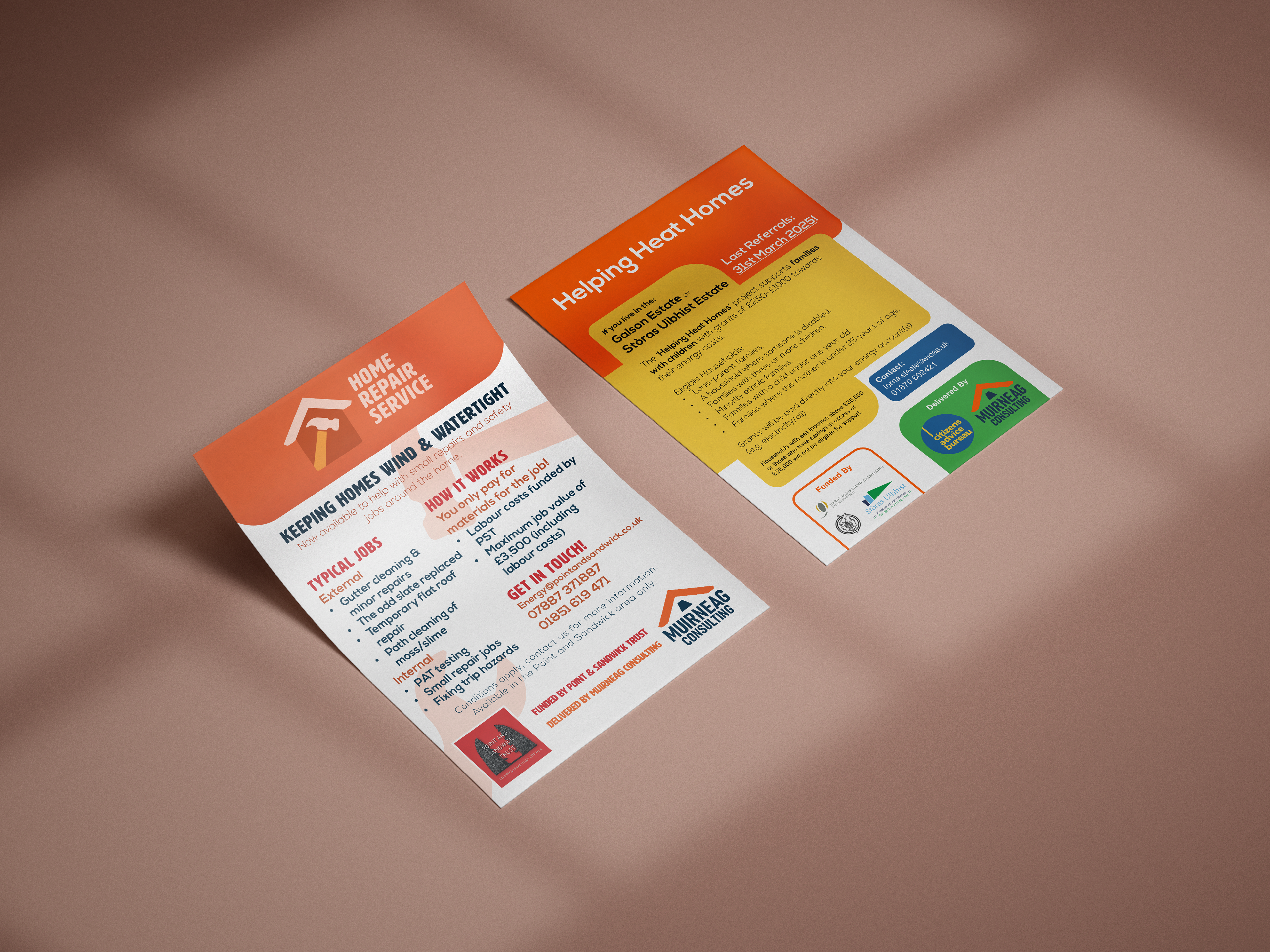
Some flyers, like those pictured above, need to be information-dense.
A simple flat gradient in Muirneag orange gives this A5 booklet a sleek appearance, while making it easy to spot.
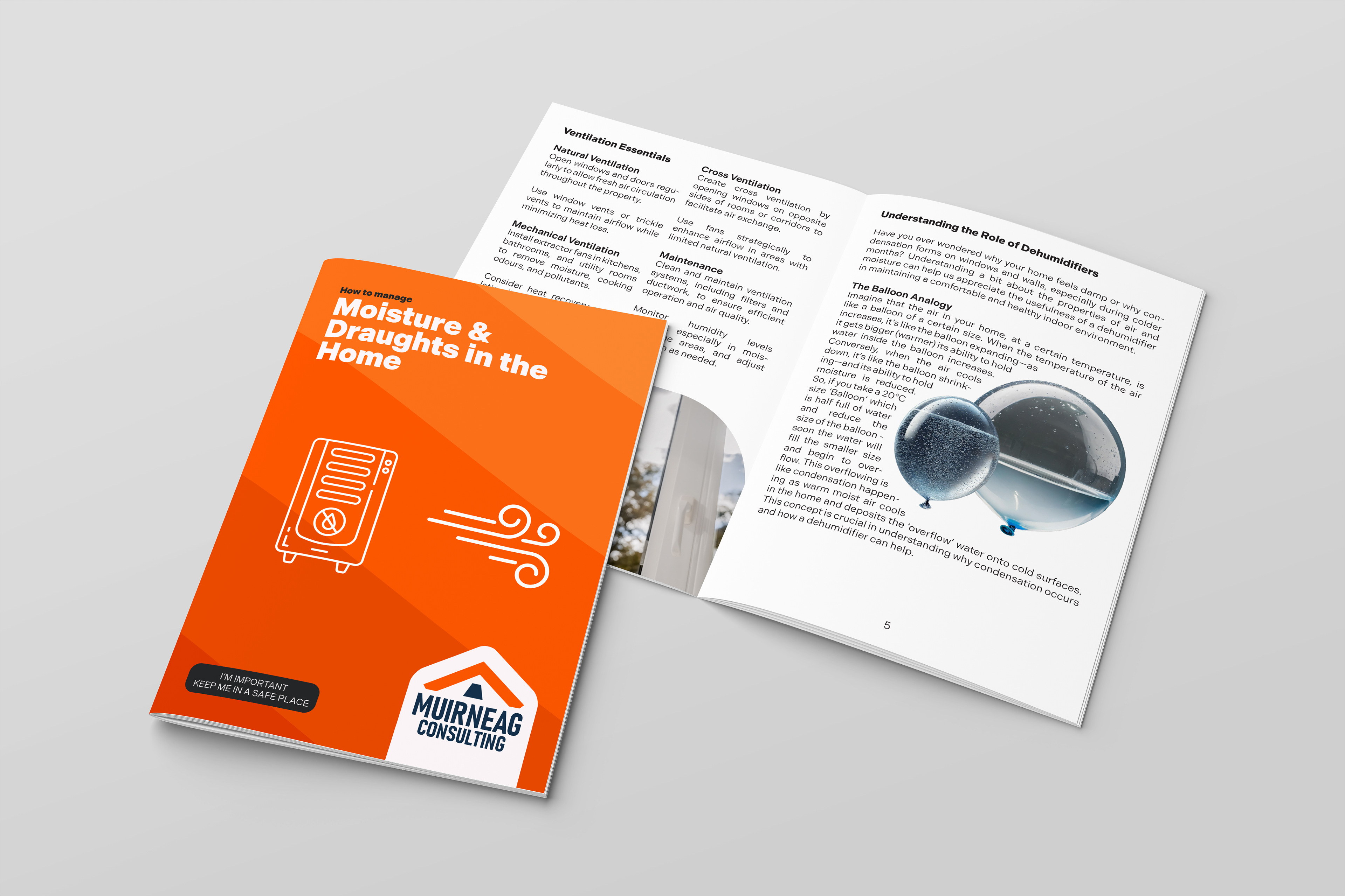
A booklet to accompany free dehumidifiers and draughtproofing.
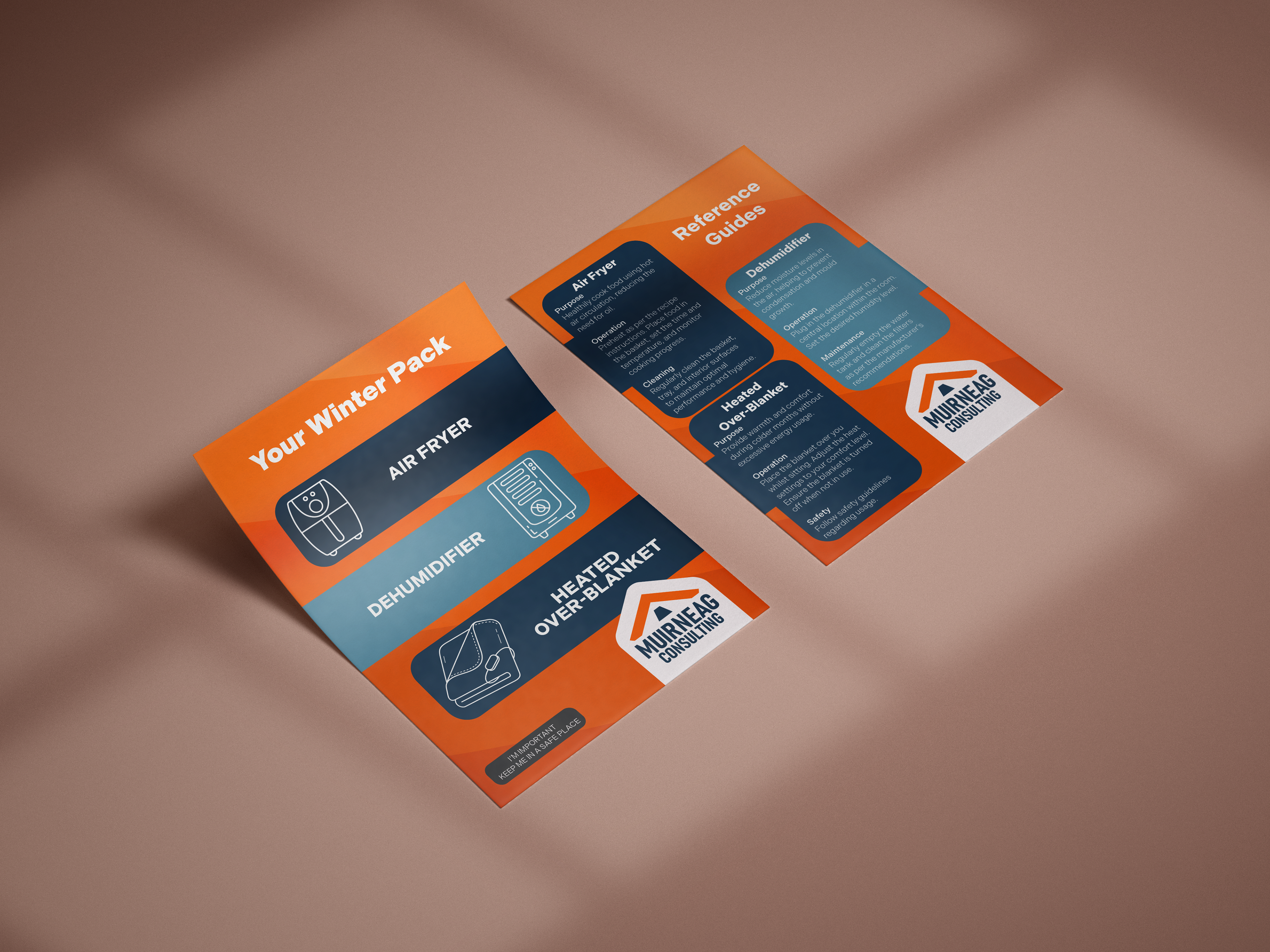
A simple double-sided flyer can pull eyes with one side and give more detailed information on the other.